

Company Background
Sacred Earth Company began as a humble line of organic hand-made superfood bars. Jam packed with all the nutrients your body wants & needs. What started with only a man, his superfood bars & the farmers market. Was being called to grow into something much greater. An upscale health & wellness boutique & educational center. Offering his original grab & go superfood bars, locally made kombucha, nitrogen cold brewed coffee on tap, artisanal juices, all natural supplements, a crystalized water fill up station, and even an essential oil sanctuary. This brand was being called to scale up in a big way. Owner James felt that while his stock of top quality products & the know, like & trust he had already established with his target market for the superfood bars would bring in those customers, the crunchy, granola, out doorsy, farmers market people were his people but he needed to attract a different market. The current branding wasn’t appealing to the stay at home yoga mom, that understands the importance of self-love and treats herself to a message & a facial on the regs. Since James already had an established following, we both agreed on the importance of maintaining consistency for his core visual identity.
Aesthetic direction
James also explained that his current logo mark was a spiritual symbol for taking a journey that ends at the source. We are all mostly water, as is this earth; hence the name of his store, Sacred Earth. Especially since the store would be one of the communities only sources of alkalized drinking water fill up station. The theme of water ran deep here. The swirl also symbolized the continuity & interconnection of everything in our world. From our continents connected by our oceans to the sand in the Sahara effecting hurricane season in Louisiana. James’ new boutique would also utilize this interconnectedness, linking amazing natural products & knowledge to a suburban community otherwise starved of it. The mood board that guided us in so much of the process of not only developing his brand but also in designing the interior of the store itself. In his mood board we incorporate that theme of earth, water, interconnectedness between us and the resources given to us, the power embedded in this earth, there for each of us to tap into, if open our selves up to it.
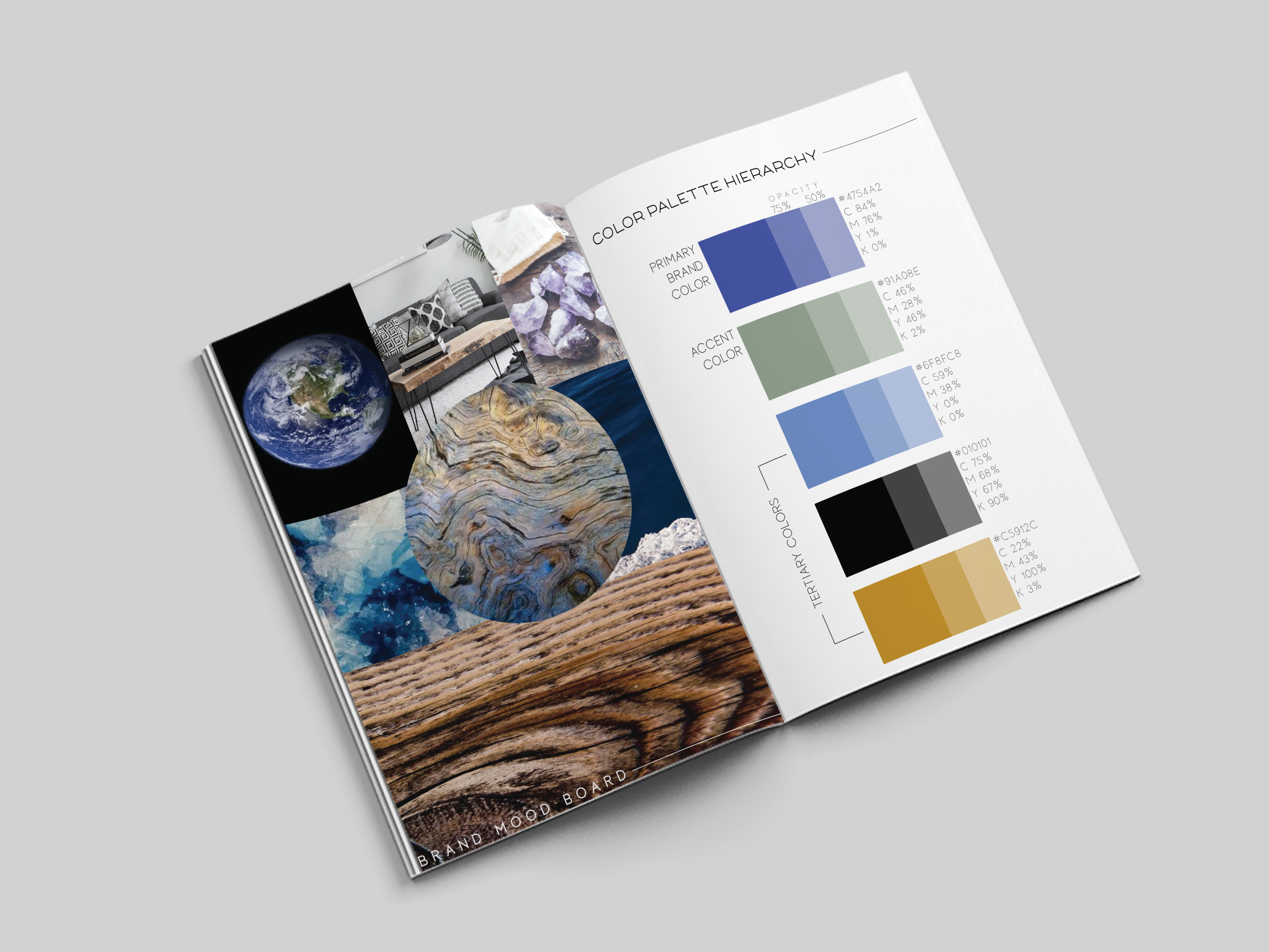
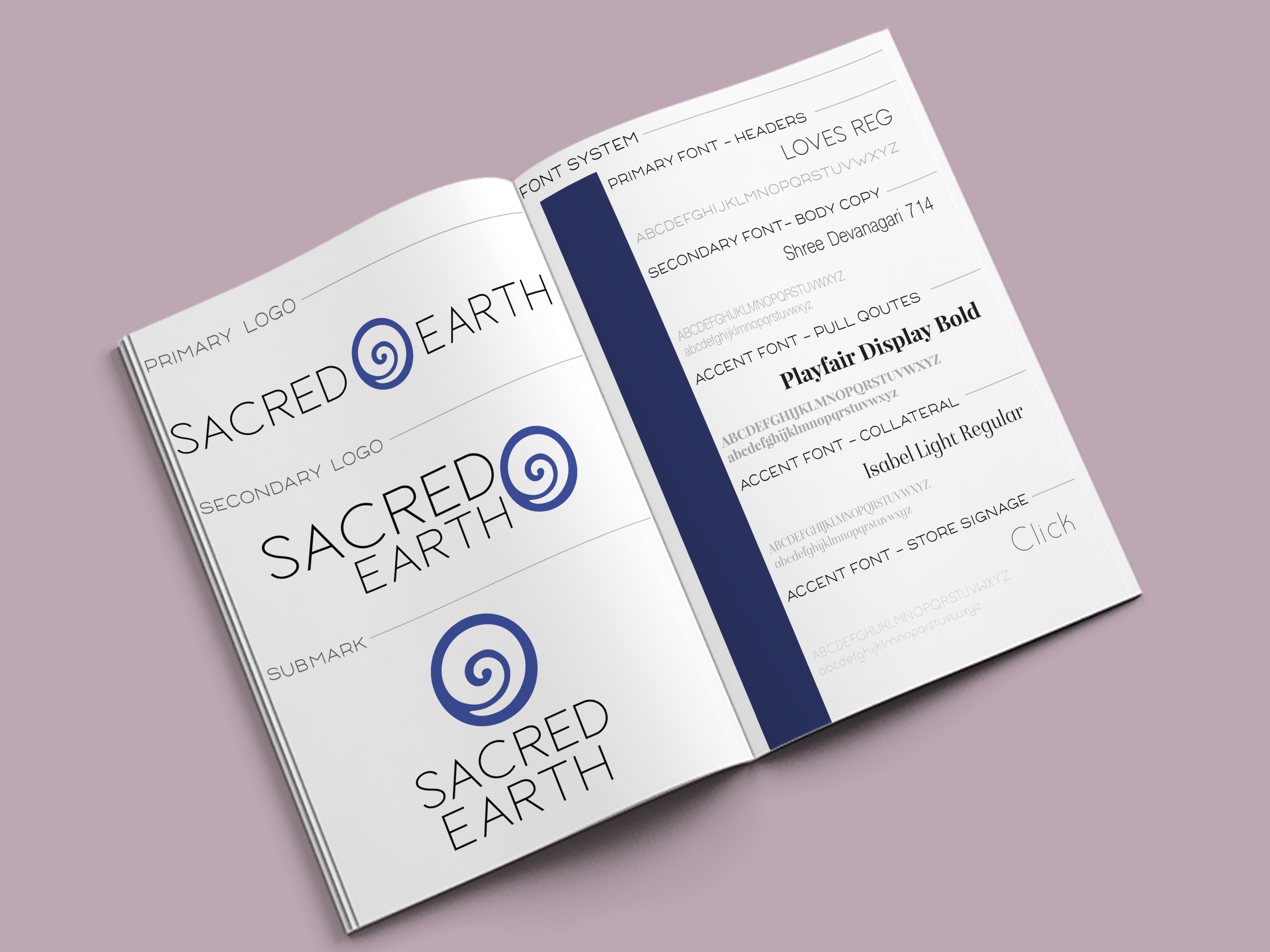
Based on information in the design questionnaire using the most recent data in color psychology trends James received a custom color palette, orange form the browns in the wood of the mood board & through out the store & because its a color most associated with organic, natural substances. The muted greens of the earth to compliment the deep rich blue. The lighter blue was a nod to his old brand, to maintain recognition with his original farmers market following. The rich watery deep soulful blue is psychologically perceived as trusting, knowledgeable, authoritative. The font choice is modern, clean, and most of all due to the words “sacred” and “earth” being perfectly balanced on either side the eye is drawn to the focal point of the main logo mark rather than competing with it. While the primary color of this brand & logo has been changed & expanded on dramatically maintaining the focus on the symbol was crucial to maintaining his brand awareness with his original following.
Once I completed my research, I unveiled to James his personally hand curated Mood Board to focus & align the development of the brand. Our outer world is a reflection of ourselves. Up-leveling your brand, is up-leveling your world. James used this board in decorating the space, with live edge tree slab coffee tables, wood shelves with industrial piping, an intimate collection of crystals displayed on beautiful rich deep brown wood shelves.
From choosing the styles of pendent lighting to the rug in the middle of the store. Sacred Earth creative direction was a jumble of emotions, ideas, & wishes through my process we turned it into a clear vision, channeling all the energy & aligning it into a single path forward for brand, web & interior design.


you said: