
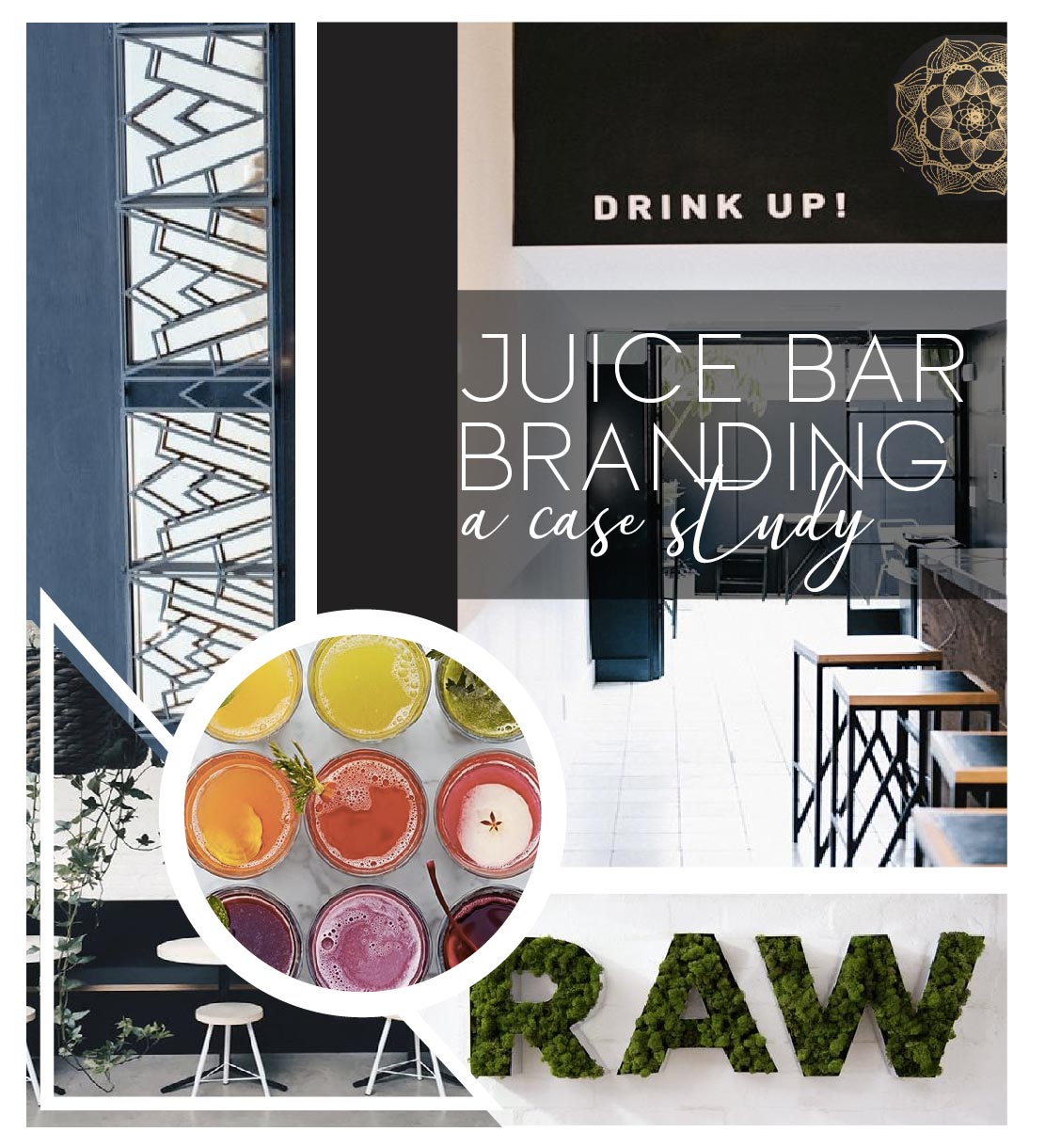

Emerge: An Artisanal Juicery. Think food is medicine. An amazing line of all natural juices made with only the best. A lot of nutrients & heart goes into each & every juice. Owner, Melodie even has her juice crew meditate before & listen to good vibe music through out their shift. Since its’ been proven plants absorb the vibes & intentions around them. That’s what Emerge is, science backed nutritious drinking. Melodie came to me looking for a brand upgrade, what began as a humble, local juicery was ready to up level & step into its own light.
Melodie was looking to appeal to a new demographic. She understood an important concept, you brand should speak for where your business is growing to, not for where it is. While she had won over the farmers market crowd it was time to open herself up to broader horizons & get her juice into the bodies of more people and educate more minds with what it means to live a healthier life. Melodie wanted the vibe of her brand to say swanky, luxe, healthy. She wanted to allow for her all natural colorful juices to be the focal point of her branding. By setting the vibe the brand through the moldboard the color palette flowed naturally.


The luxe deep green accent color in the double helix logo mark & color palette emphasizes her plant based science that is the backbone of her juicing approach. While maintaining continuity of the upscale vibe of the brand. She ultimately decided to have all her logo’s in the solid gold, with the green accent an an option. The muted blue accents the rest of her palette while also providing an option for producing collateral for events that cater to Emerge’s original customer base, the crunch granola farmers market demographic to whom the gold & black doesn’t appeal to as strongly.
By using a monochrome color palette primarily with the foremost colors being gold, white & black we draw in the viewers eye, causing Emerge to stand out among its’ competition while allowing for her colorful juices to take the main stage. Thought was given to how Emerge would continue to attract its original demographic while upholding its new luxe branding by utilizing the muted blue & green accent colors in her palette.


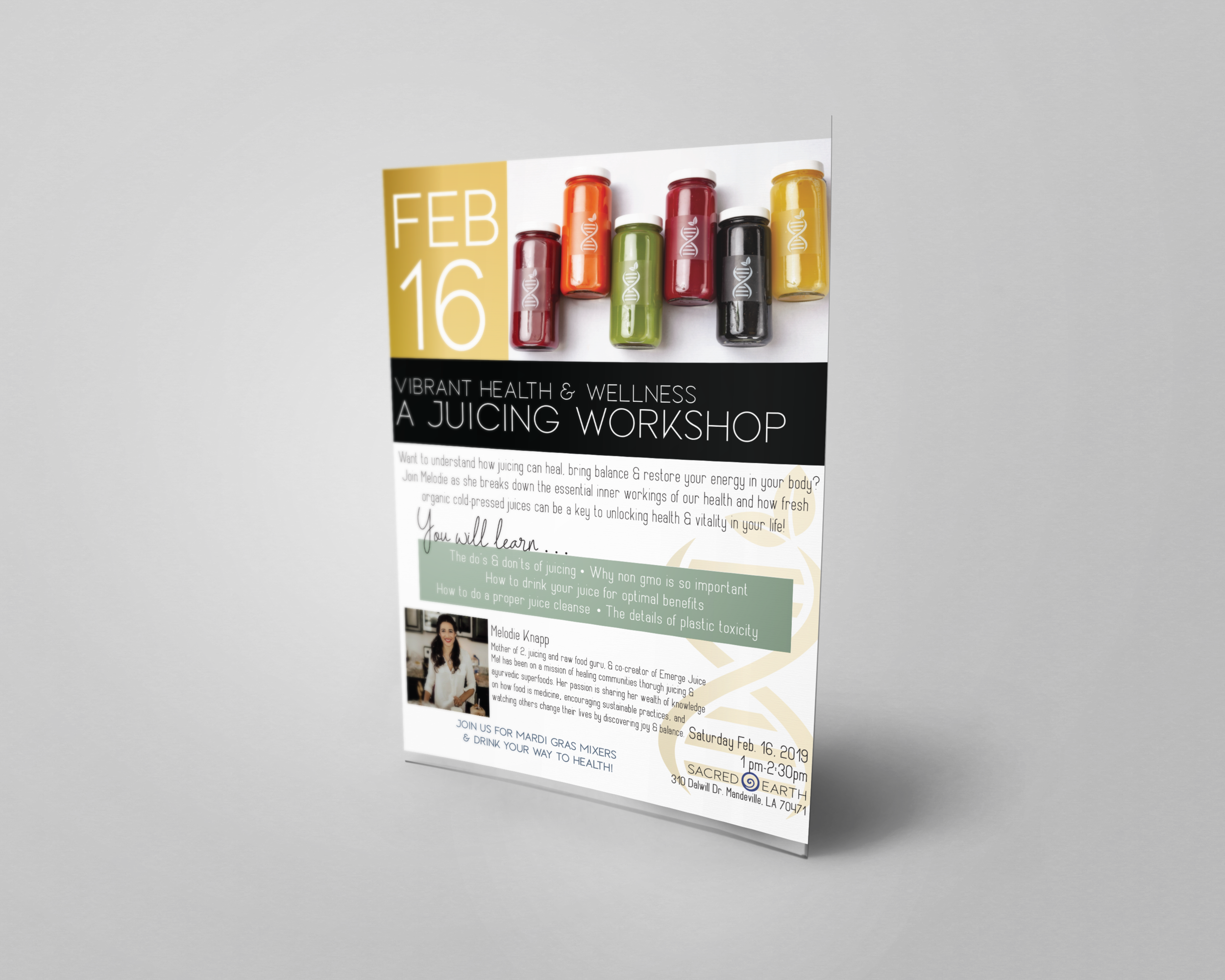
Emerge’s goal is to help people live healthier lifestyles by providing them with organic juice, educating people on healthy lifestyles and using food as medicine. However leading a healthy lifestyle & juicing means educating your audience, a lot! Since so much of the business collateral was informational Emerge had interesting requirements for its Font System. It required at least 2 fonts for body copy (for differential purposes as exhibited in the informational cleanse card below). As well as 2 complimentary fonts to be used as eye catching headers to support the flow of information. This can also be seen below with the title of the card “Cleanse Types” so the reader knows the overall content of the card but the “What’s your intention” in the script font to differentiate the different cleanse purposes: Evolve, Emerge, or Elevate. Because Melodie prides her business on elevating the consciousness of the planet by empowering her customers through knowledge it was very important that the font choice for her body copy not only kept with the clean, upscale vibe of the brand but also needed to be narrow, condensed and easy to read on printed materials or the web.

What originally was emoji’s, Melodie wanted to continue the use of symbols in her informational pieces. However, the standard brightly colored emoji’s took away from her upscale branding, so designing a custom line of single color symbols that would be cohesive to her branding was a necessity.

One other uppercase, narrow header font was needed for informational pieces & graphics that was reminiscent of her original brand line & would speak to her original demographic, while also complimenting least 1 of the other 2 header fonts. It was important for this font to be narrow as its main purpose was to be used as an informational header font. As detailed in her Brand Manual this font is only to be used in the green or blue accent colors.
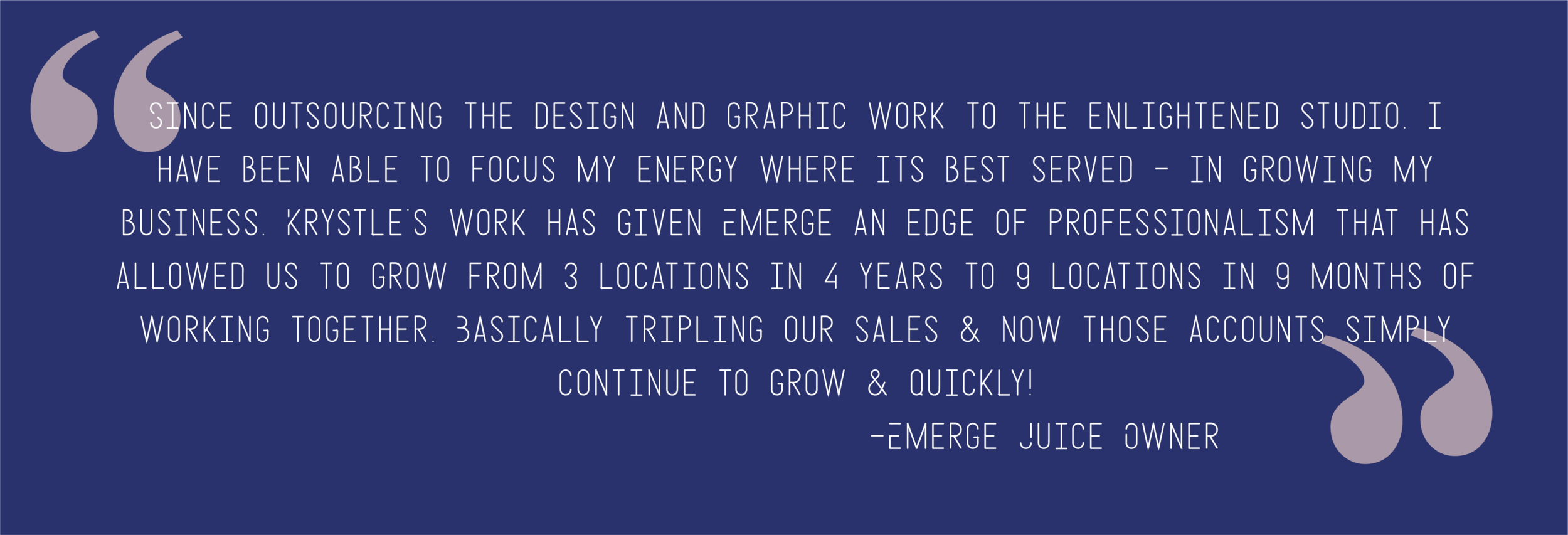
The impact of Emerge’s new branding is far reaching. Within the first 9 months of launching Emerge’s new brand the company opened 6 new locations. Social media following nearly doubled, and most importantly, nearly triple in sales, for the first time in 4 years the company is profitable!


It is meaningful beyond words that this is my gift that I get to share with the world. I seek to help empower the masses while making this world a better place than I found it. Being able to work with amazing companies like Emerge that put sustainability & offering their customers the best product they can higher on the priority list than their own profits, lights my soul on fire. Helping to make companies that help the world & empower their consumers a success so they can extend their reach & impact more peoples lives is my heart led work. It is with a heart full of gratitude that I am able to play a small role in helping people take back their health & life into their own hands.


you said: